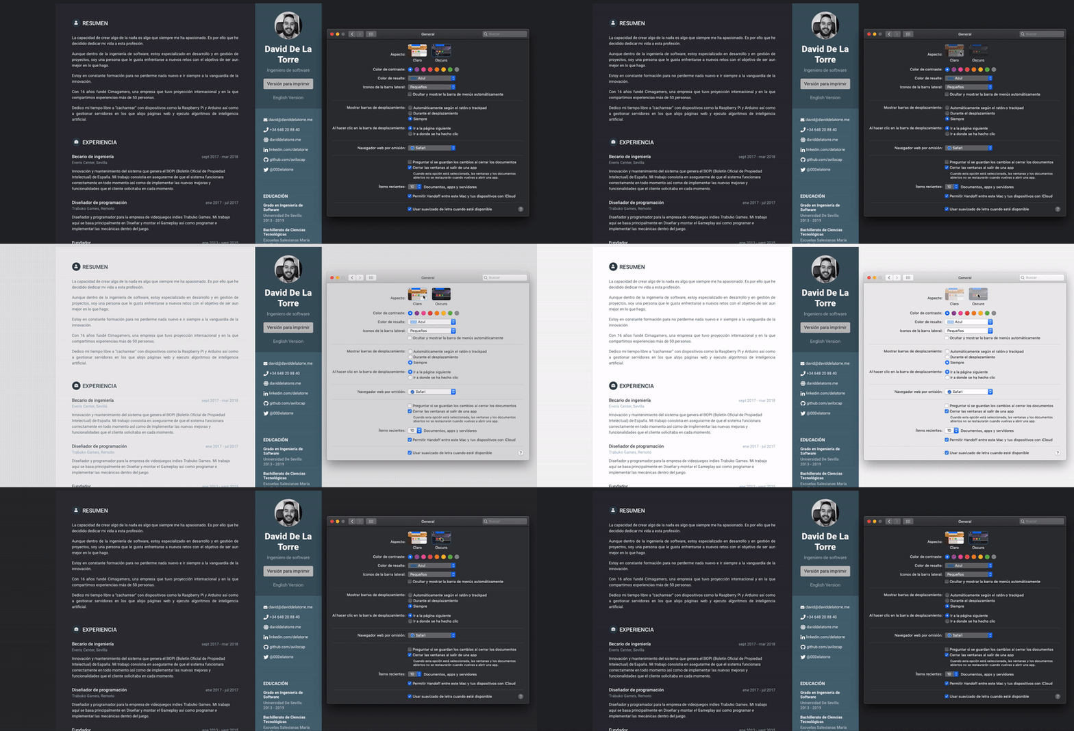
How to make your web pages look great with dark mode on operating systems
Apple introduced Dark Mode at the WWDC in 2018, which changes the tonalities of the entire operating system to adapt to low-light environments. This functionality can also be applied to the web pages that we view in this mode. However, to ensure proper adaptation, Apple does not do it automatically. Instead, developers and web designers are encouraged to adapt their interfaces to Dark Mode, following the design patterns specified in the Human Interface Guidelines.
The good news is that adapting your website to Dark Mode is easy. Apple allows Safari to detect a media query to apply design changes depending on the mode selected by users. It’s as easy as adding the following block to the CSS stylesheet of your web page:
 @media (prefers-color-scheme: dark) {
/* Tus parámetros aquí */
}
Within this block, you can include the CSS parameters that you want to apply when Dark Mode is active, such as the background or font color. For example:
@media (prefers-color-scheme: dark) {
  body {
    background: #26272A;
    color: #F3FCFB;
  }
}
And that’s it! With this simple step, your web pages will look great in Dark Mode on operating systems. Additionally, this implementation will also work with Dark Mode on iOS, which was rolled out with version 13 of the operating system.

If you have any questions about how to implement this functionality or if you want to share with me how your website turned out, don’t hesitate to contact me through the contact methods that I have made available. Happy developing!